Congratulations on the great work and effort you’ve put into improving the platform. We’ve noticed that several new features and updates have been added recently, and it’s great to see the platform continuously evolving.
It would be greatly appreciated if you could share tutorial videos or send notifications explaining the new updates and how to use them. This would help users better understand the new features and get the most out of the platform.
Thanks again for your continuous efforts and improvements!
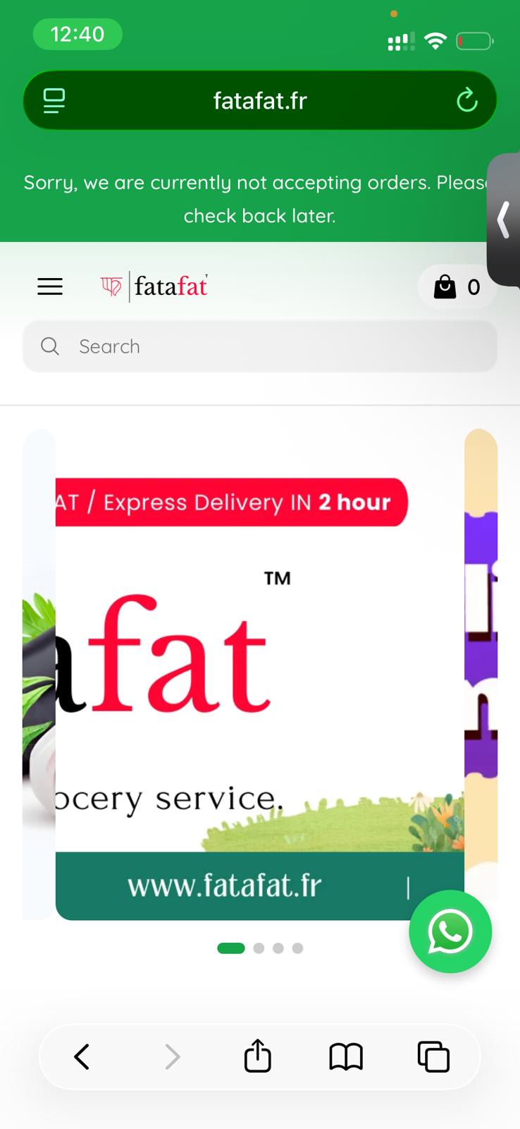
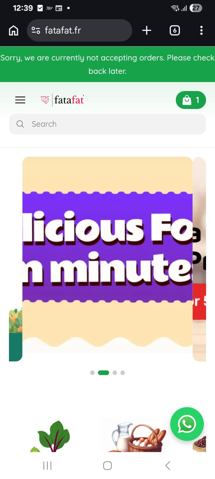
In the Fresh Theme, the banner slide format has a display issue in mobile view. Please refer to the images below for reference.
The issue occurs when attempting to change the carousel height configuration from Automatic to any other fixed size. This change causes a layout glitch in the banner slider on mobile devices.
Additionally, on iOS devices, the category images are experiencing a layout issue where they overlap or collide with each other, causing visual inconsistencies in the category grid. This appears to be a responsive rendering problem specific to iOS. Not happening in Android.
From our perspective, all the themes are well designed and have their own strengths. However, after evaluating the available options, we have decided to proceed with the Classic theme. Below are our observations from the comparison:
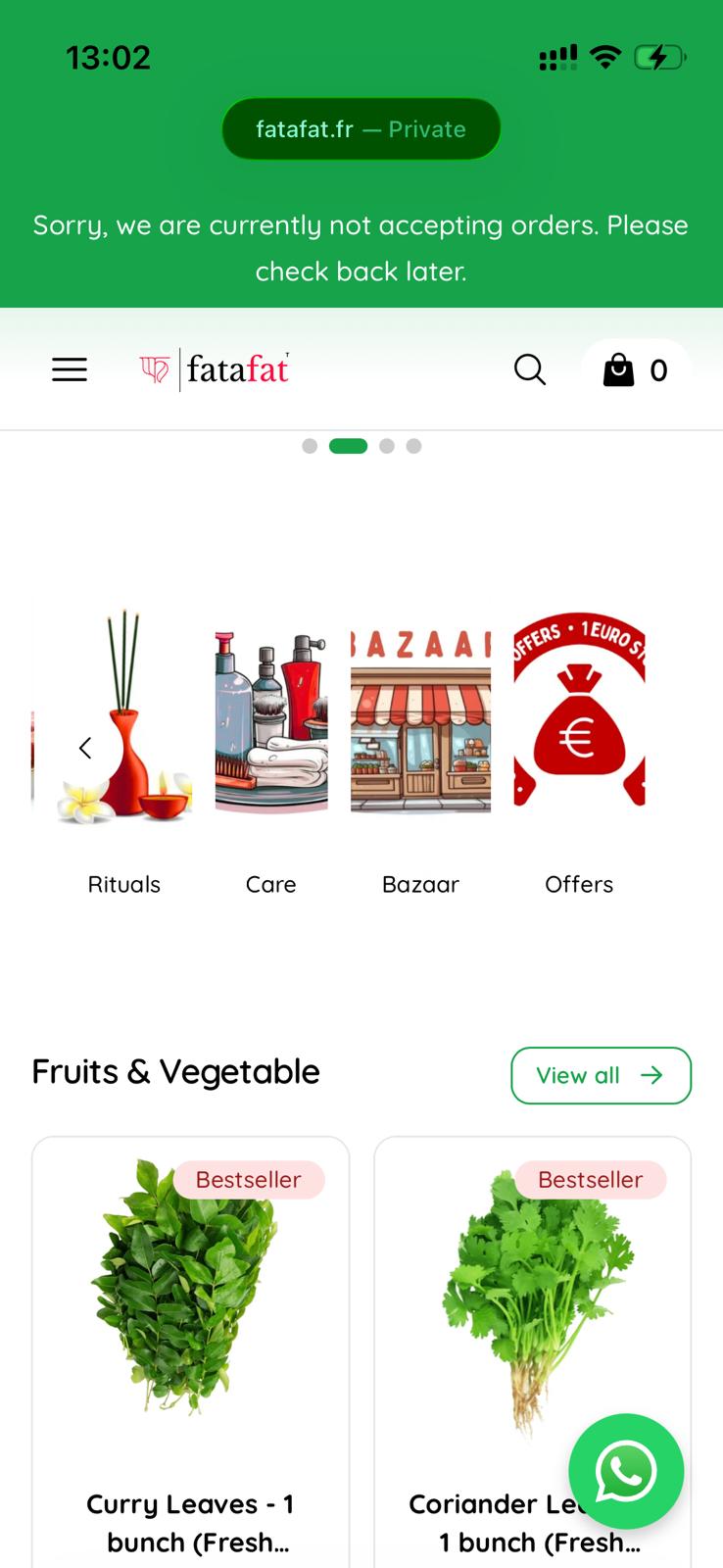
We particularly liked the banner carousel functionality in the Modern theme, along with the way category icons are positioned and displayed, which enhances the visual hierarchy of the homepage.
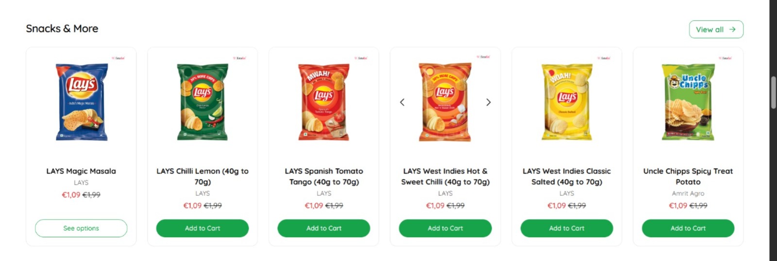
On the other hand, the product carousel implementation in the Fresh theme appears more optimized for the desktop/web layout. Instead of displaying 4 products per row, it supports 6 products within the viewport, which creates a more balanced and efficient use of screen space.
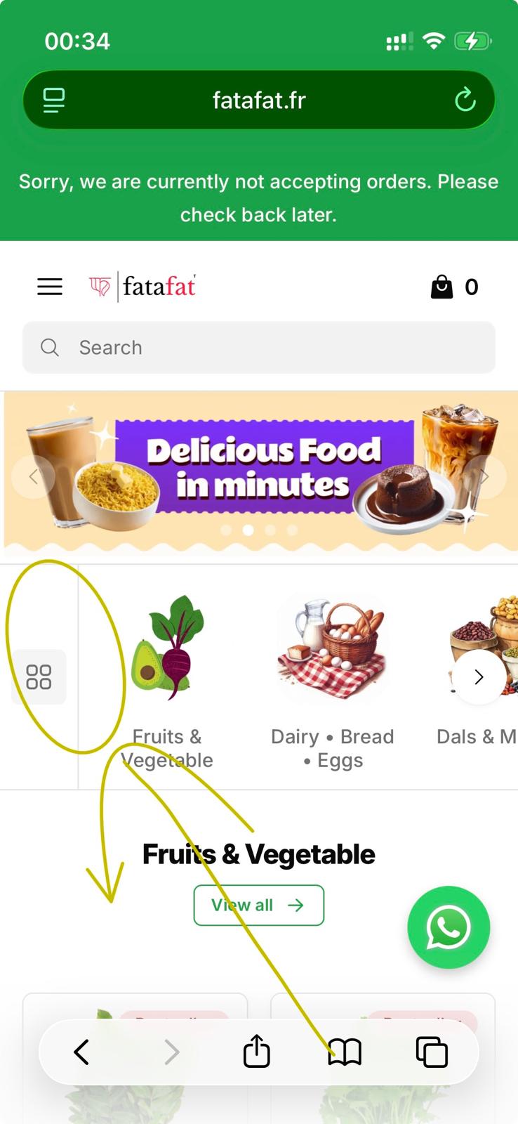
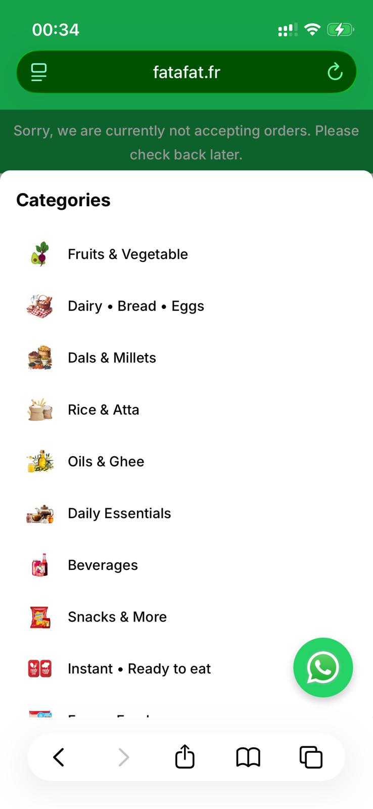
Despite these advantages, we ultimately chose the Classic theme due to one feature that we consider critical: the quick and intuitive access to the category list in the mobile interface. The ability to open and navigate categories easily in the mobile preview significantly improves the user experience and product discovery flow.
Ideally, we would have preferred a modular or component-based structure, where elements such as banners, product carousels, and category navigation could be mixed and matched across themes. This would allow greater flexibility in assembling the optimal layout.
Nevertheless, we appreciate the improvements and the new features introduced. Congratulations and thanks to your entire team for the continued development and enhancements.
You have to wait and should not expect a quick response. They might be working in a different timezone than yours. It’s true they sometimes respond late, but they will get back to you.
Also, tomorrow is Eid and it’s a festival for most of their team members, so have some patience so have some patience, they will reply.